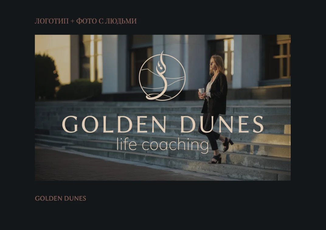
Brand identity and a one-page website for a life-coaching practice serving English-speaking expats in the UAE — built around the metaphor of golden desert dunes.
01Challenge
Golden Dunes is a life-coaching brand created for English-speaking expatriates living in the UAE — professional women, executives and individuals navigating personal and career transitions. The client came looking for a distinctive logo and website that would communicate trust, clarity and personal growth.
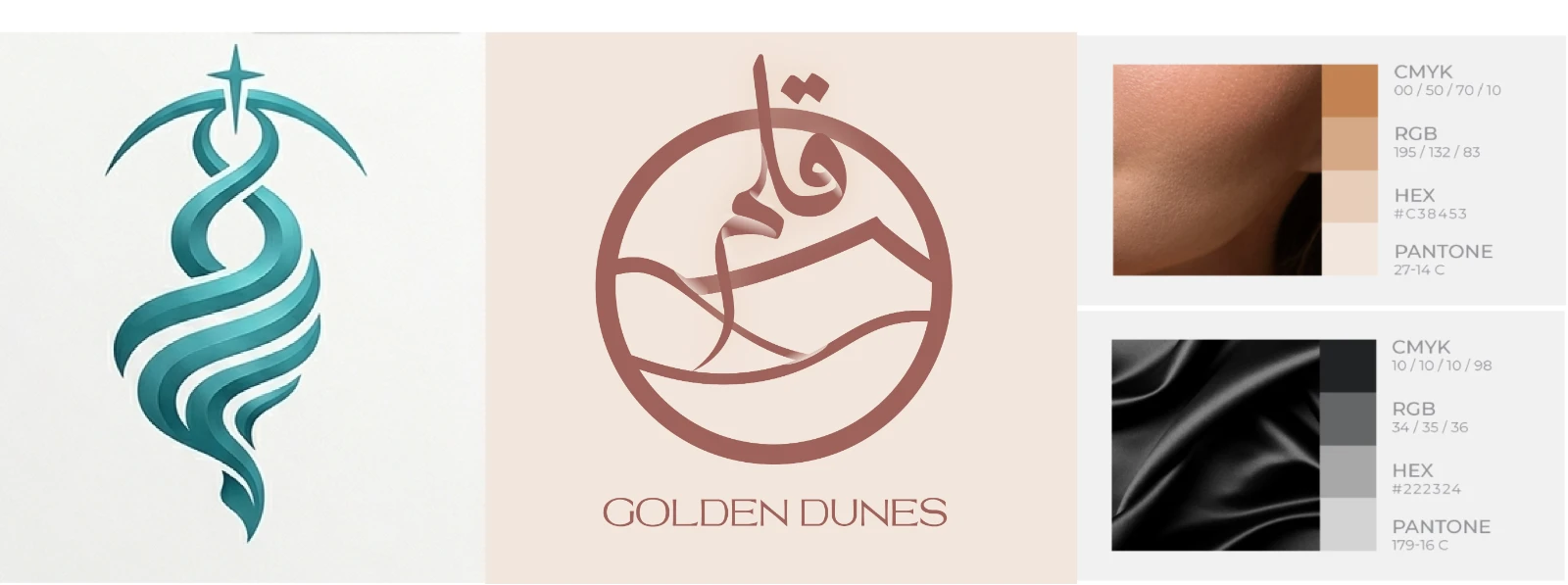
At the start, the brand was built around universal coaching themes — personal growth, life journeys, transformation, confidence and goal achievement — with early concepts exploring spirals, pathways and abstract symbols of progress. Meaningful as they were, none produced a strong, memorable identity.
02Research
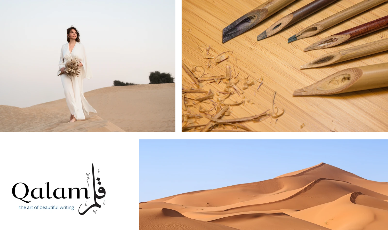
The turning point came when the project shifted toward a new concept — Golden Dunes. The image of desert dunes became a symbol of resilience, transformation, adaptability and personal evolution.
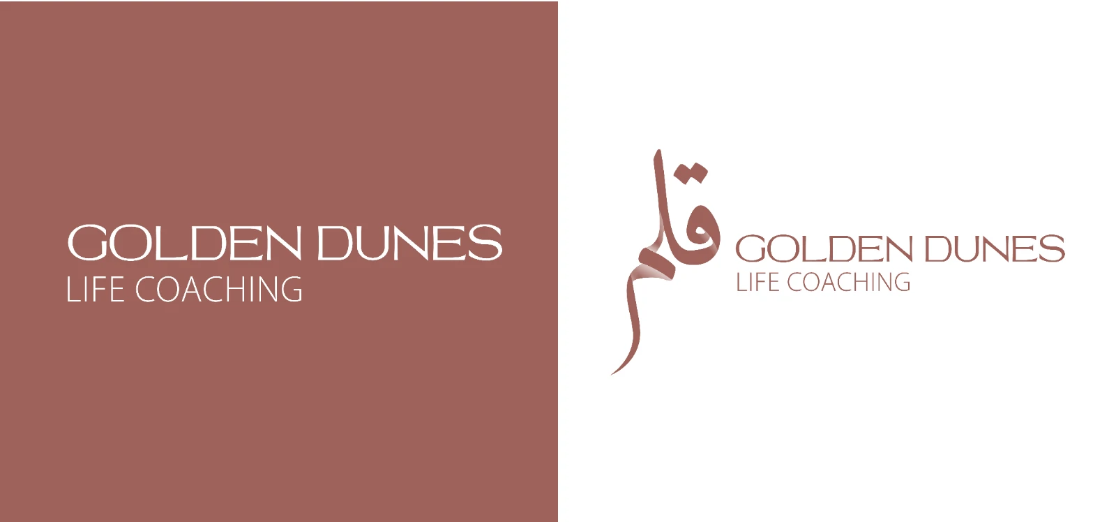
An additional layer of meaning came through Qalam — a traditional symbol of wisdom, knowledge and conscious self-development. Together, these two ideas formed the foundation of the brand identity.
The breakthrough wasn't a better symbol of growth — it was a culturally rooted one.
03Solution
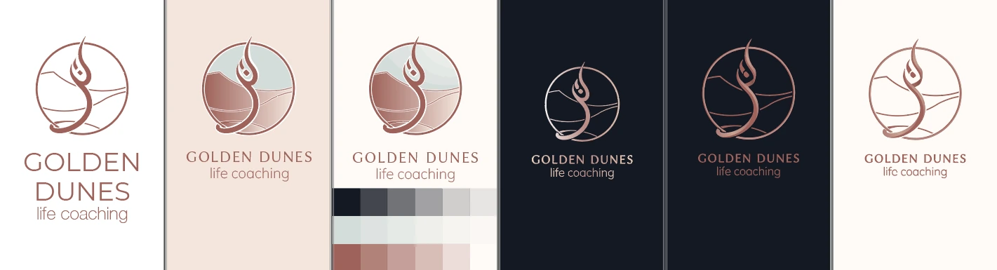
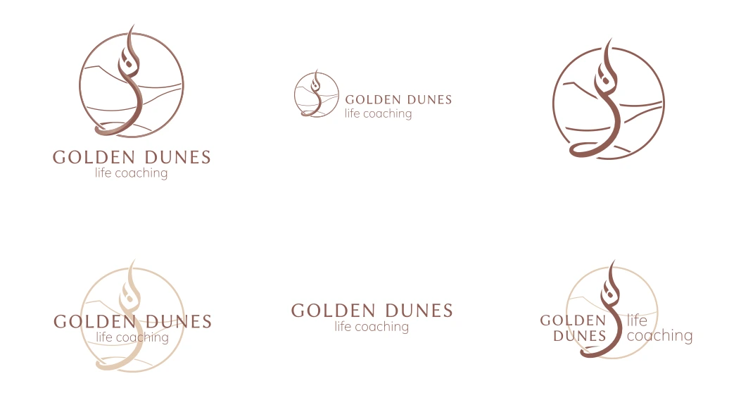
The goal was to combine both concepts into a single cohesive mark. The final logo integrates dune shapes for movement and transformation, a pen-and-feather form for wisdom and self-reflection, and a circular structure expressing balance, harmony and continuity.
The result is a minimal yet meaningful symbol that performs effectively across both digital and print applications.
04Visual Direction
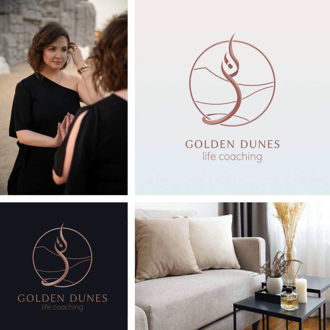
The visual language draws on the natural colours of the desert — warm sand tones, deep charcoal and rich dark-blue accents.
Together they balance professionalism, warmth and emotional depth, giving the brand a calm and confident presence.
05Website
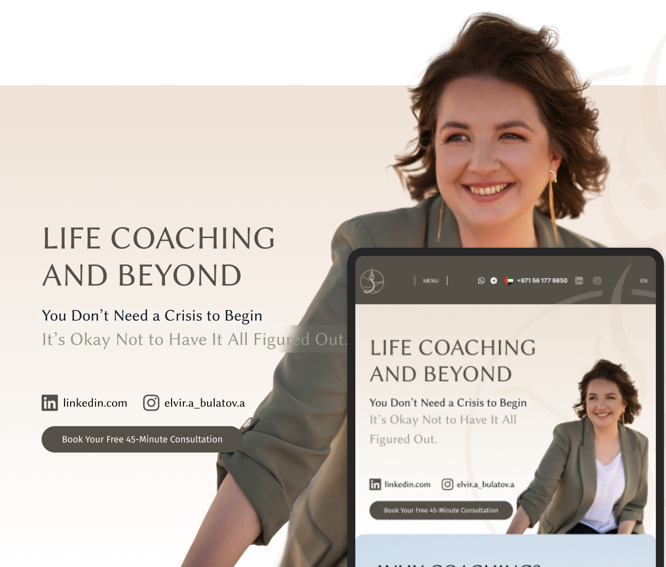
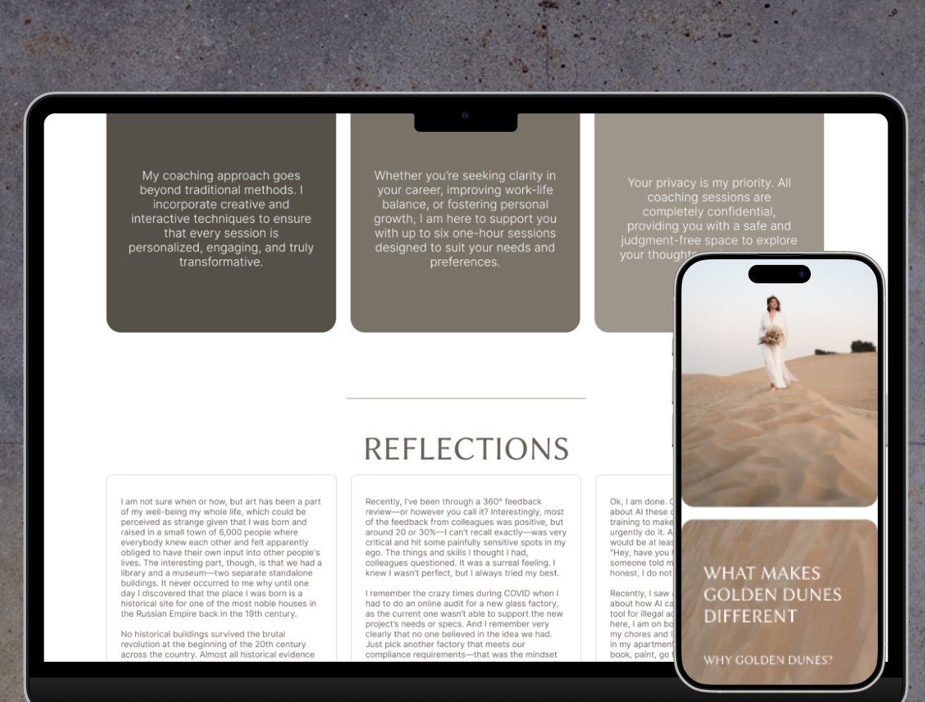
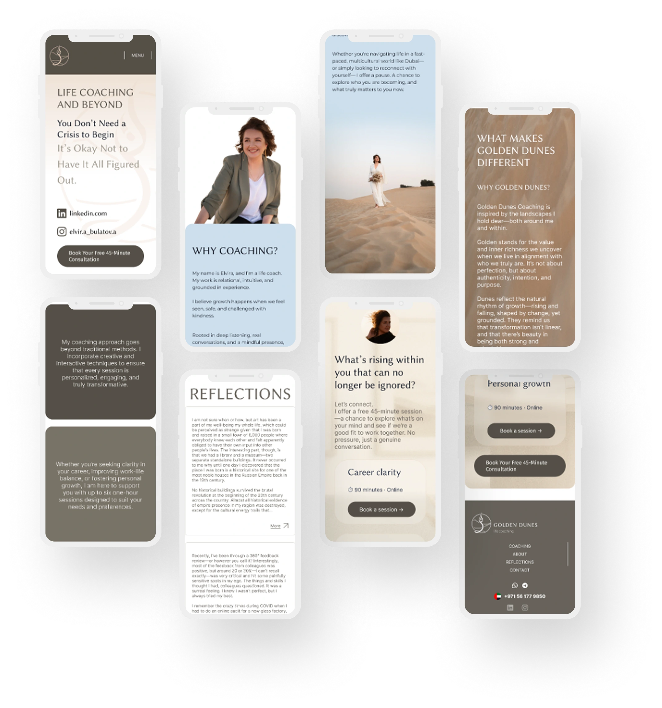
Following approval of the identity, a responsive one-page website was designed. The client provided the content and photography, while the structure was built around the core coaching philosophy and brand positioning.
Key sections — Hero, Why Coaching, What Makes Golden Dunes Different, Reflections and a closing Call to Action — focus on a sense of trust, calmness and personal connection.
06Outcome
The project transformed an abstract coaching concept into a distinctive brand built around a strong, culturally meaningful visual metaphor.
The Golden Dunes identity connects themes of resilience, growth and transformation, while the website extends this narrative into a cohesive digital experience.