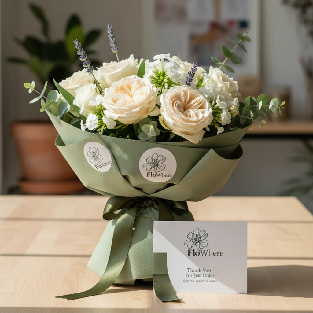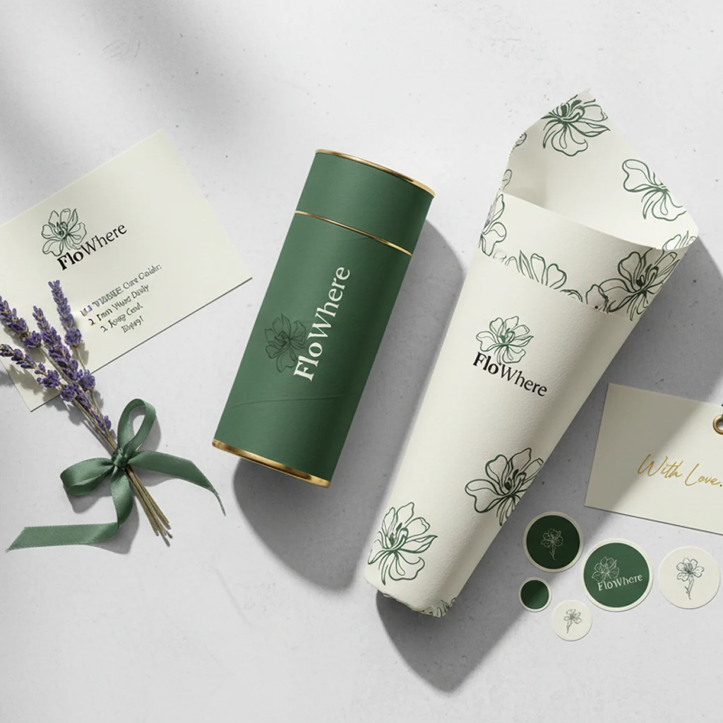
What began as a request for bouquet-packaging stickers grew into a brand refresh — a cleaner logo and a cohesive print system for a boutique floral studio.
01Challenge
Flowhere is a boutique floral brand built around handcrafted bouquets and the emotional side of gifting. The studio came with a very specific request: a set of branded stickers to finish its packaging.
The initial scope was small — bouquet stickers, flower-care cards and a few supporting pieces for customer communication — and everything had to work within the existing logo. As the work progressed it became clear the current identity was holding the brand back, and a packaging task quietly grew into a broader brand refresh.
02Research
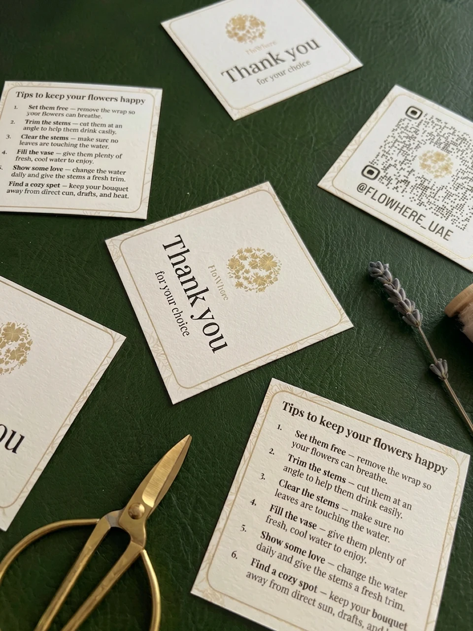
Phase one worked within the existing identity. We designed a series of stickers and flower-care cards, keeping the brand recognisable while adapting its graphics to real, everyday use by florists — practical, tidy and easy to apply.
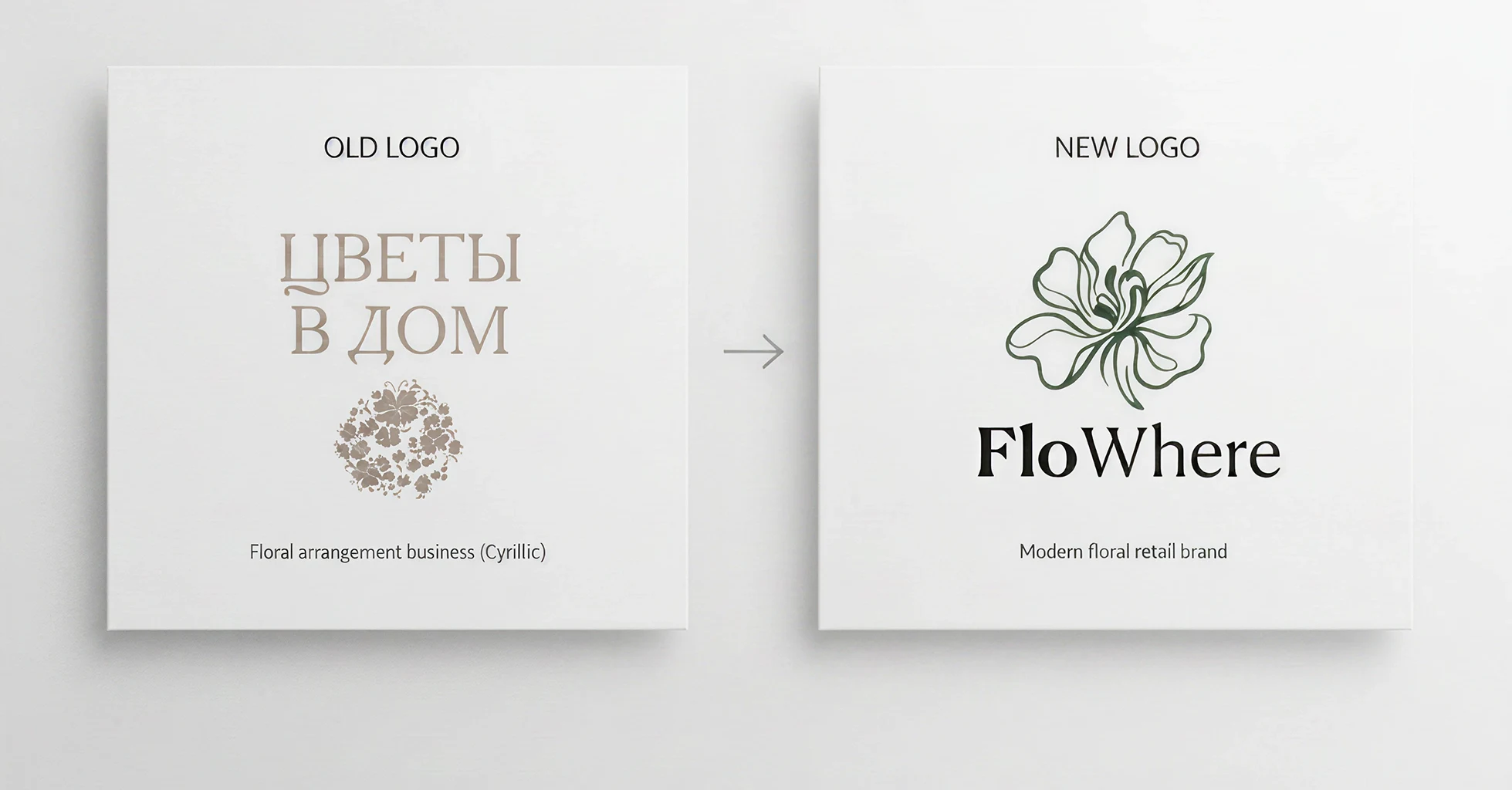
Putting the identity onto physical materials exposed its limits: the old logo lost legibility at small sizes, was awkward in print, felt visually heavy and had no consistent way to scale across formats. Because packaging had become the brand's main point of contact, these issues were impossible to ignore.
Packaging became the brand's main touchpoint — and it's where the old logo's limits showed.
03Solution
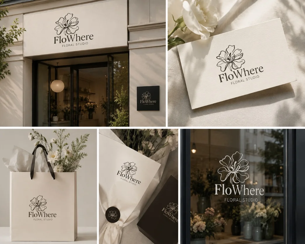
The next step was a full refinement of the logo. The new version keeps the recognisable Flowhere name but moves to cleaner geometry, stronger legibility and far better adaptability across print and digital.
The goal was a single mark that holds up everywhere — equally clear on a small sticker, a greeting insert and across the brand's wider communication.
04Visual Direction
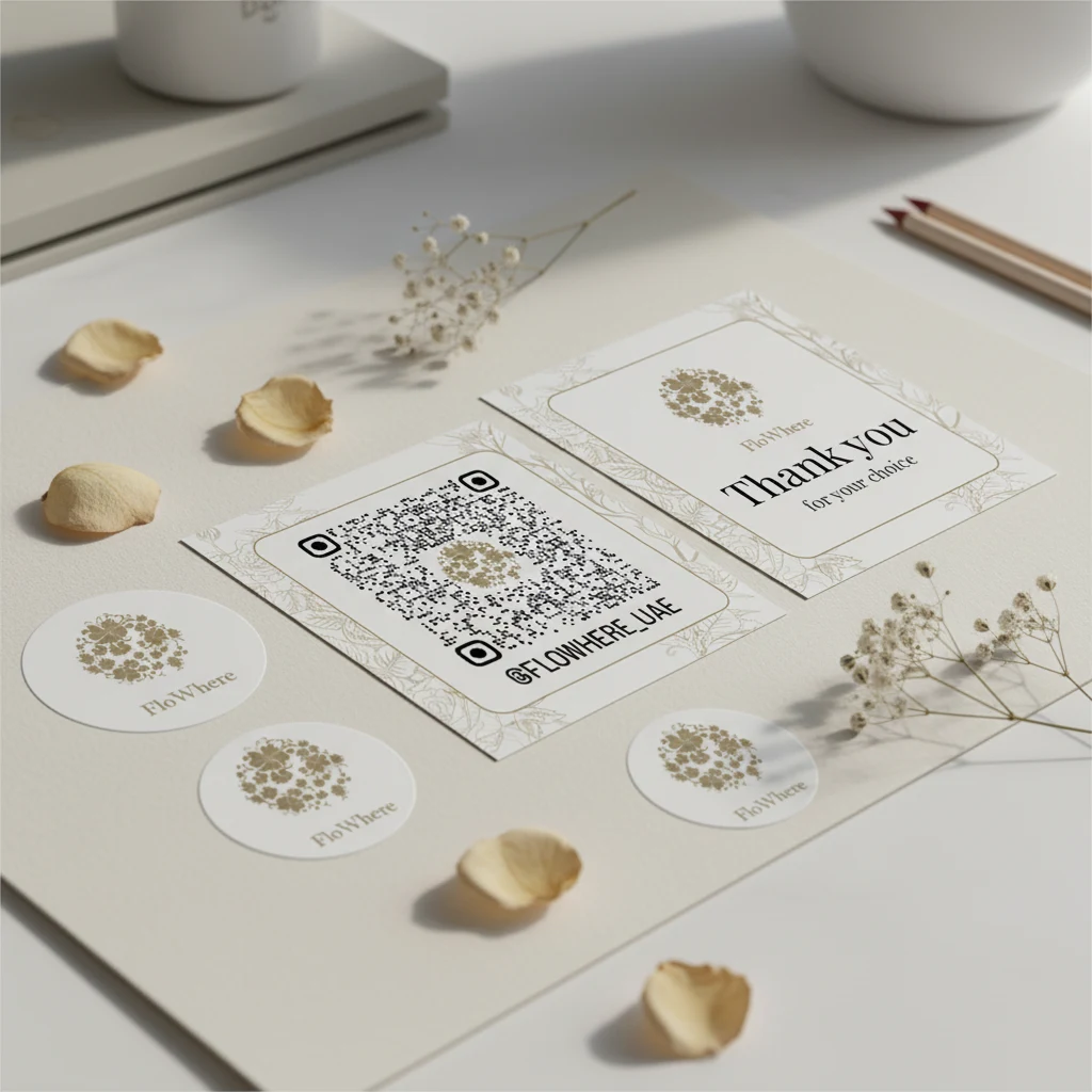
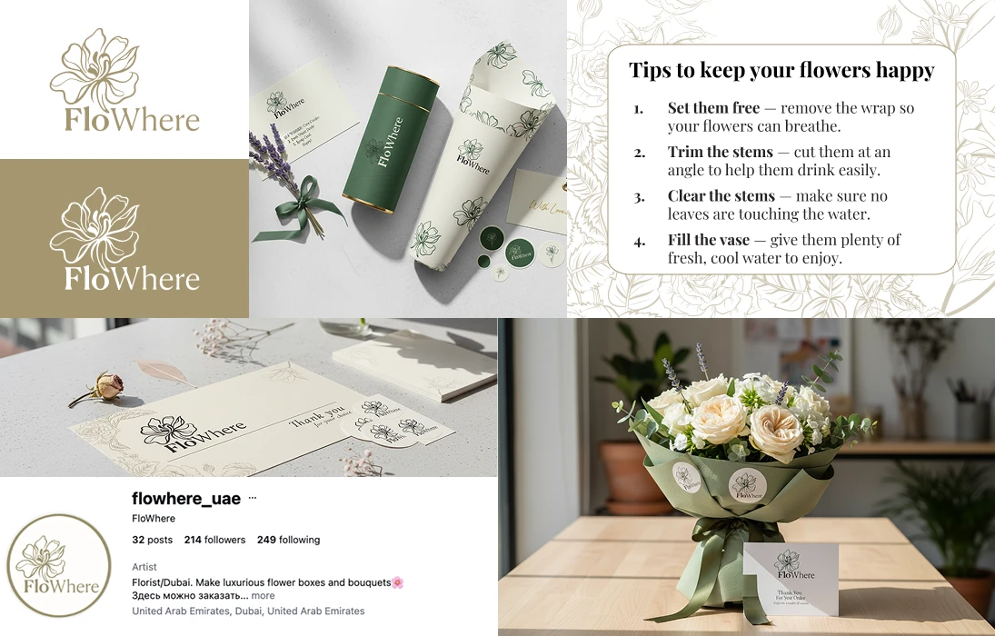
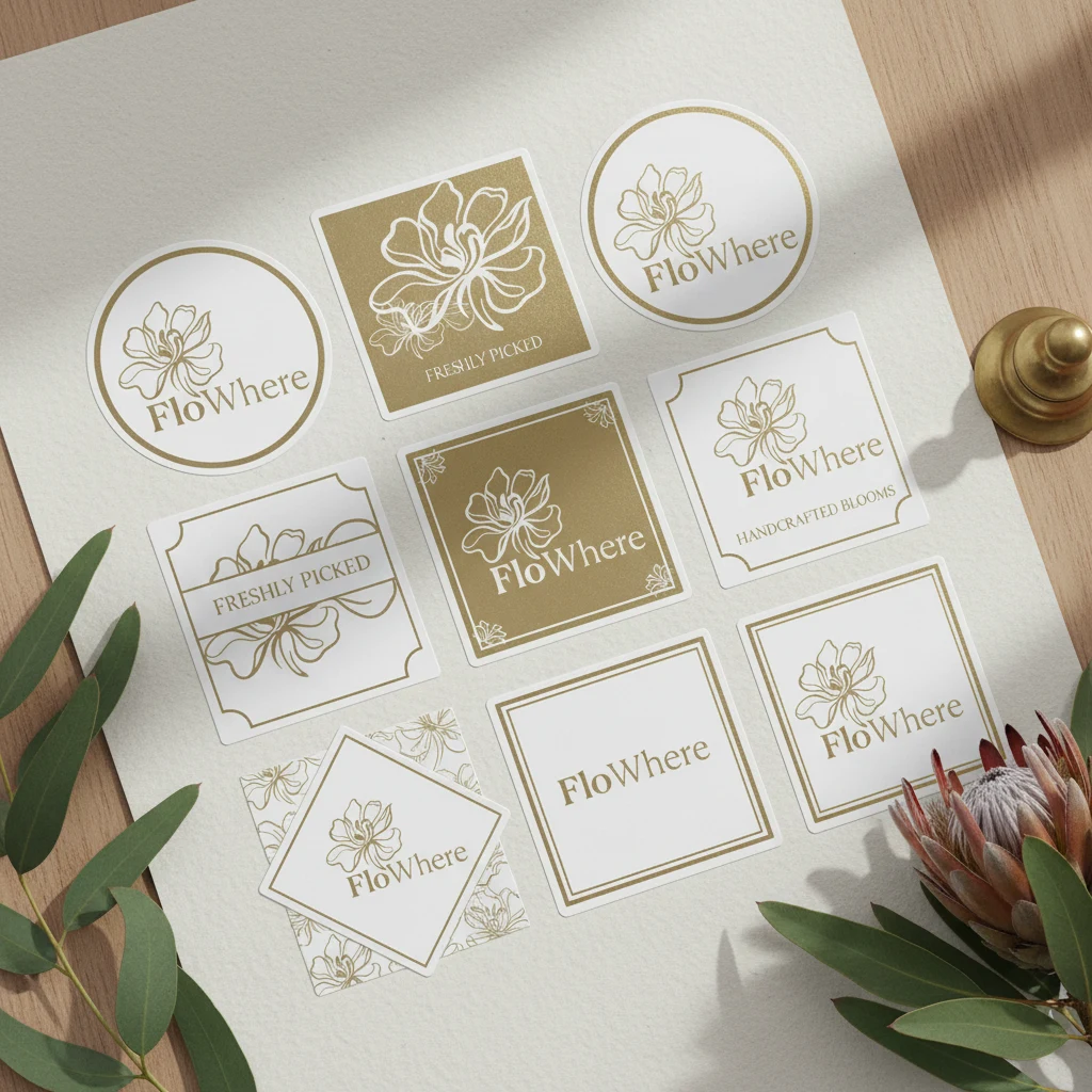
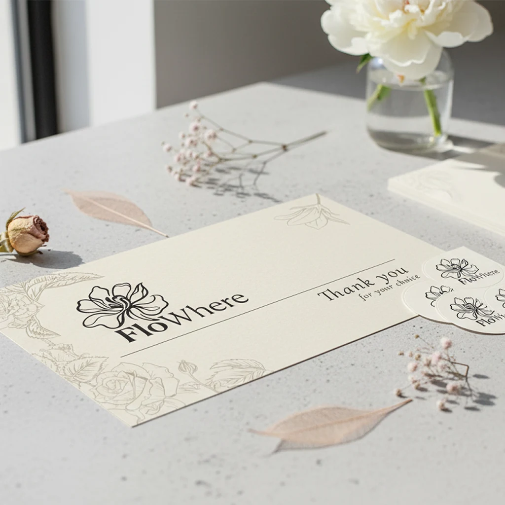
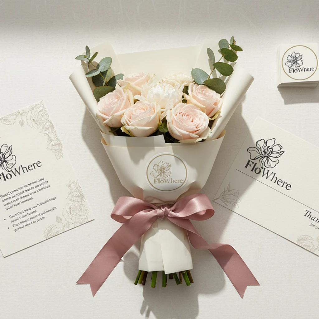
With the new mark approved, every earlier piece was rebuilt to match. The refreshed system brings together branded stickers, flower-care cards, greeting inserts and supporting presentation materials into one coherent set.
Held together by the studio's sage-and-khaki palette and gold-foil accents, the collateral now reads as one brand at every step of the customer experience.
05Outcome
To show where the identity can go, we built a series of conceptual brand mockups — packaging applications and branded collateral that demonstrate how the system scales as the studio grows into new touchpoints.
What started as a simple packaging request became a broader brand transformation. Flowhere came away with a more refined, flexible and scalable identity that supports both today's packaging and the brand's future growth.