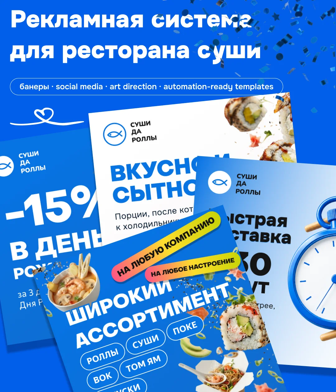
An advertising system for a sushi delivery brand — banners, social cards and stories in one visual language, plus templates the team fills straight from the menu catalogue.
01Challenge
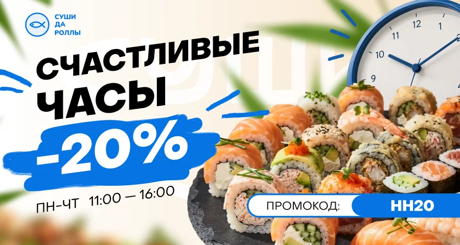
Sushi da Rolly delivers rolls, sushi, poke, wok and tom yum. The brief started small: two 900×480 banners for the restaurant's Yandex Maps listing — Happy Hours at −20% Monday to Thursday, 11:00–16:00, and −15% for birthdays — plus a carousel of 650×650 cards, one per brand promise: fast delivery, generous portions, freshness, range, easy ordering, loyalty bonuses.
The real job was bigger than a few pictures: a recognisable style for the whole ad series, banners for very different offers, and templates the team could keep producing from the menu catalogue without a designer.

02Research
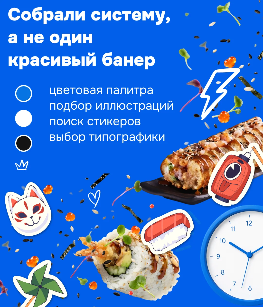
Instead of one good-looking banner, we built a kit: a palette of signal blue, white and black; food imagery with flying rolls, roe, sesame and microgreens; Japanese-inspired stickers — a kitsune mask, a paper lantern, a pinwheel; and type that pairs a heavy, wide grotesque with handwritten notes.
A system, not one pretty banner.
03Visual Direction
The original logo — a thin fish in a circle with a light wordmark — got lost on saturated blue and at avatar sizes. It was adapted rather than redrawn: a larger, bolder mark, a denser and wider wordmark, a white version for blue banners and a separate light version for the website.


04Solution
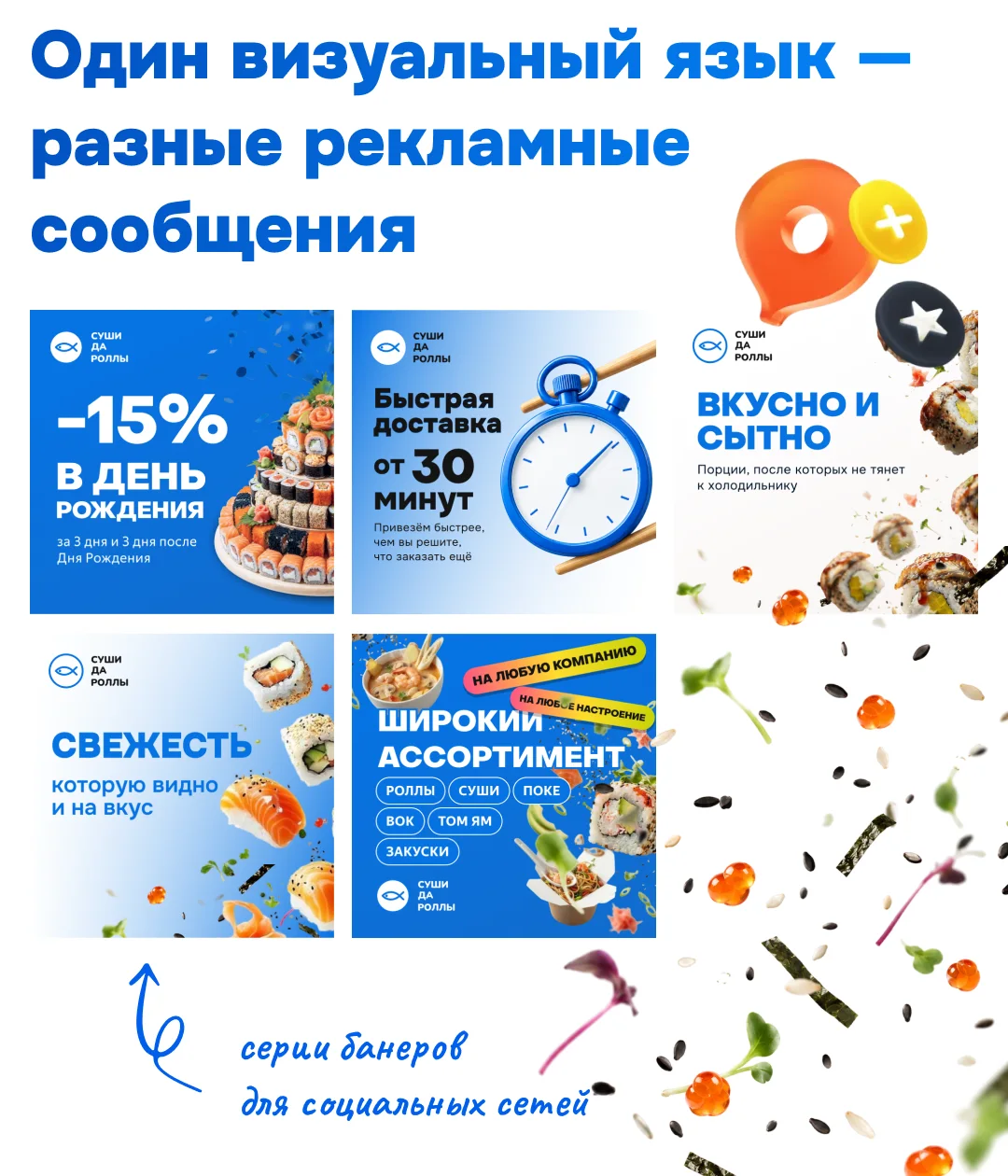
One visual language carries very different messages — a discount, delivery speed, portion size, freshness, range — so every card reads as the same brand at a glance.
A separate idea for speed: instead of the obligatory lightning bolt, a stopwatch held in chopsticks — fast delivery shown in the language of the food itself.

05Applications
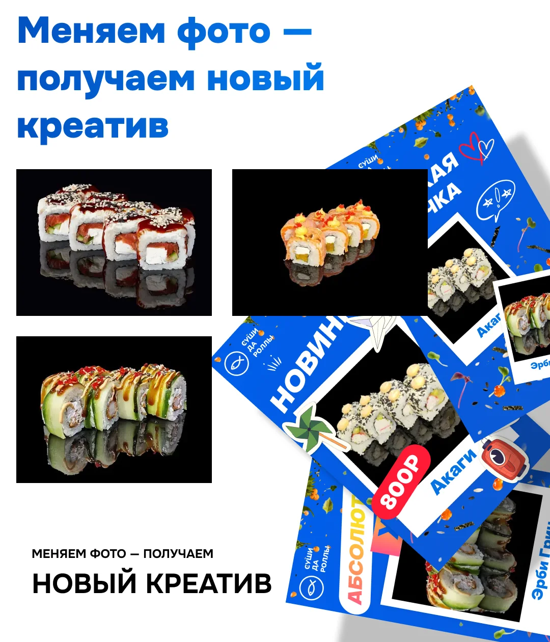
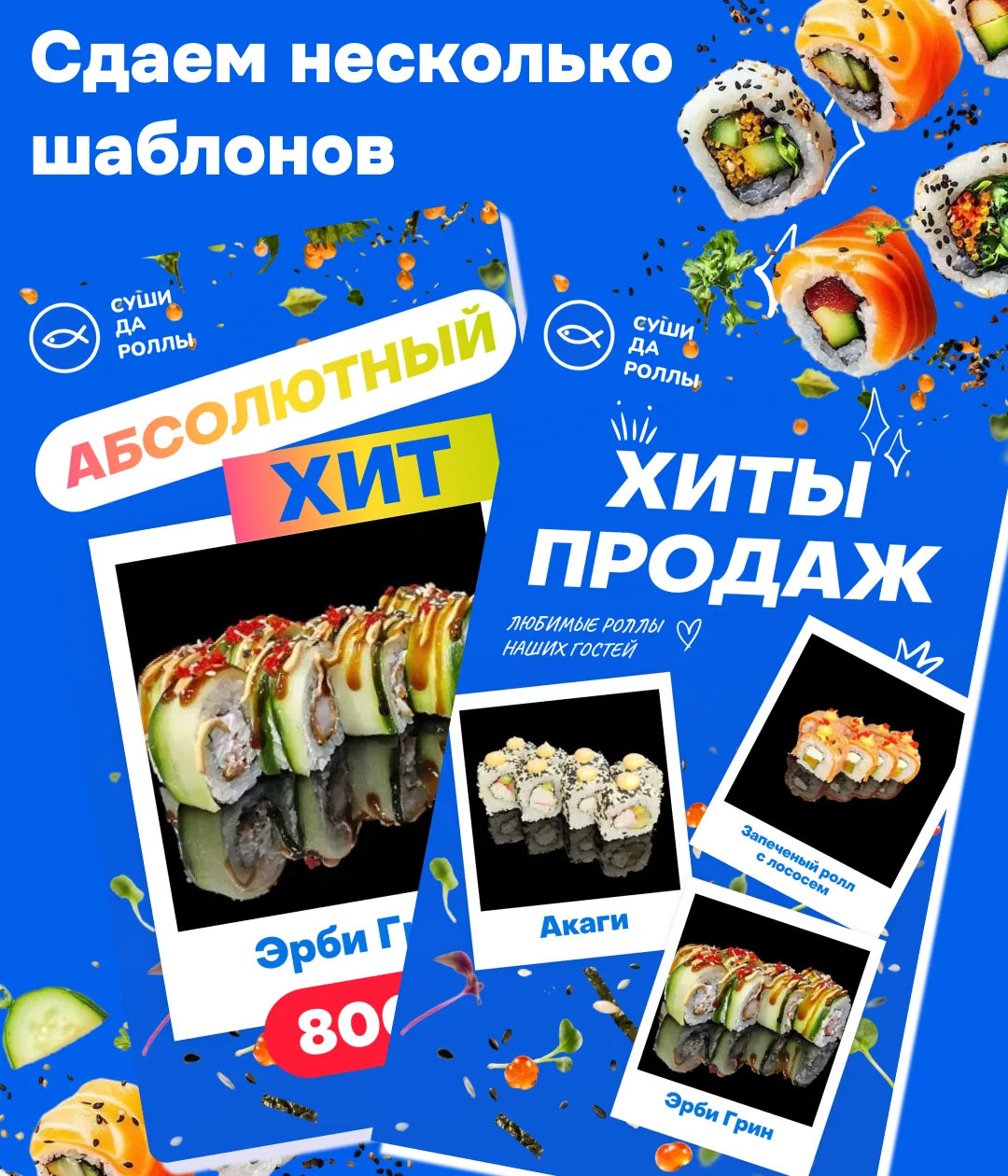
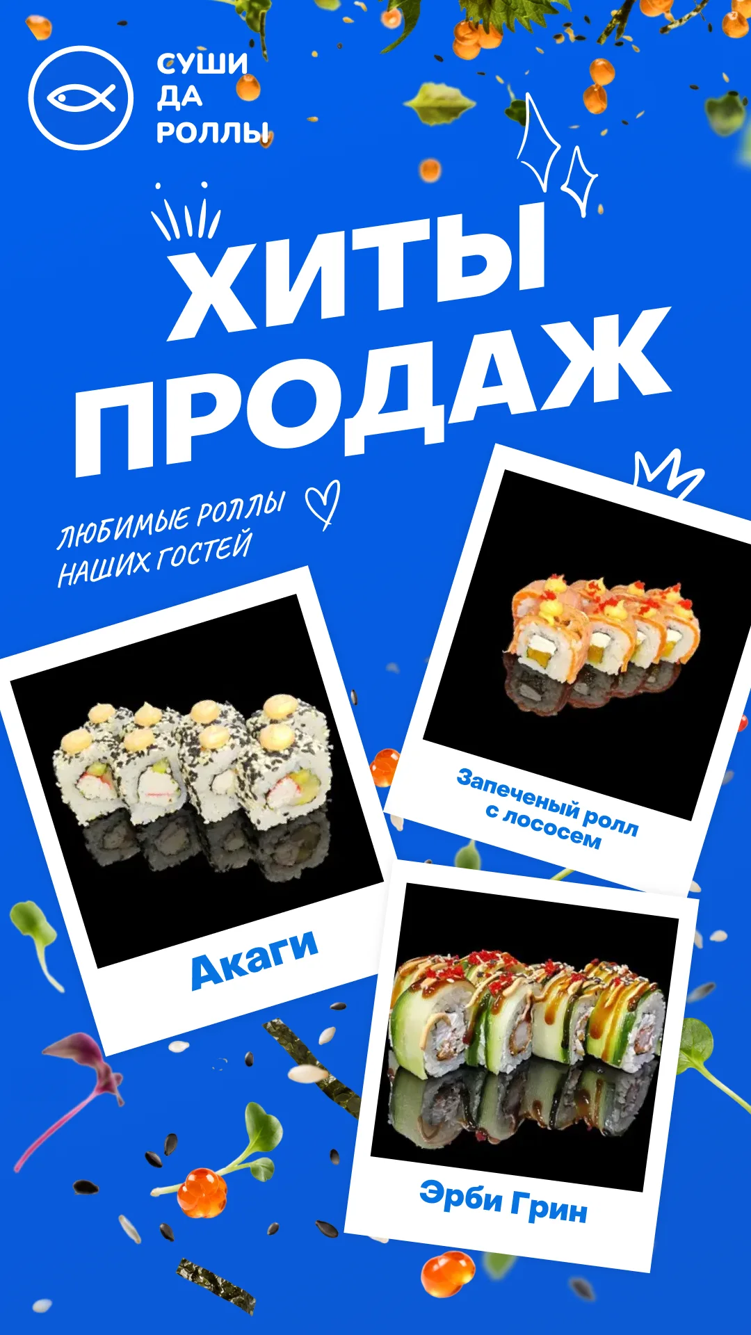
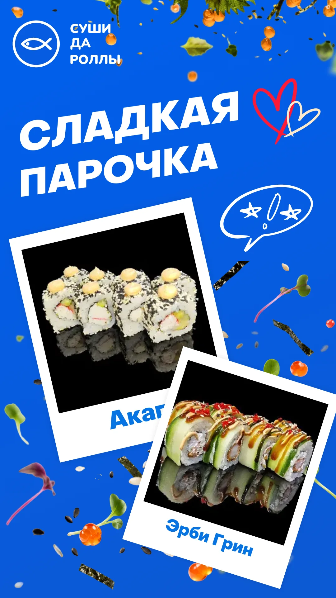
The templates are what make it scale: swap the product photo and you get a new creative. Best-sellers, new arrivals, sweet pairs and single hero products all come from the same layouts — in posts and in 9:16 stories.
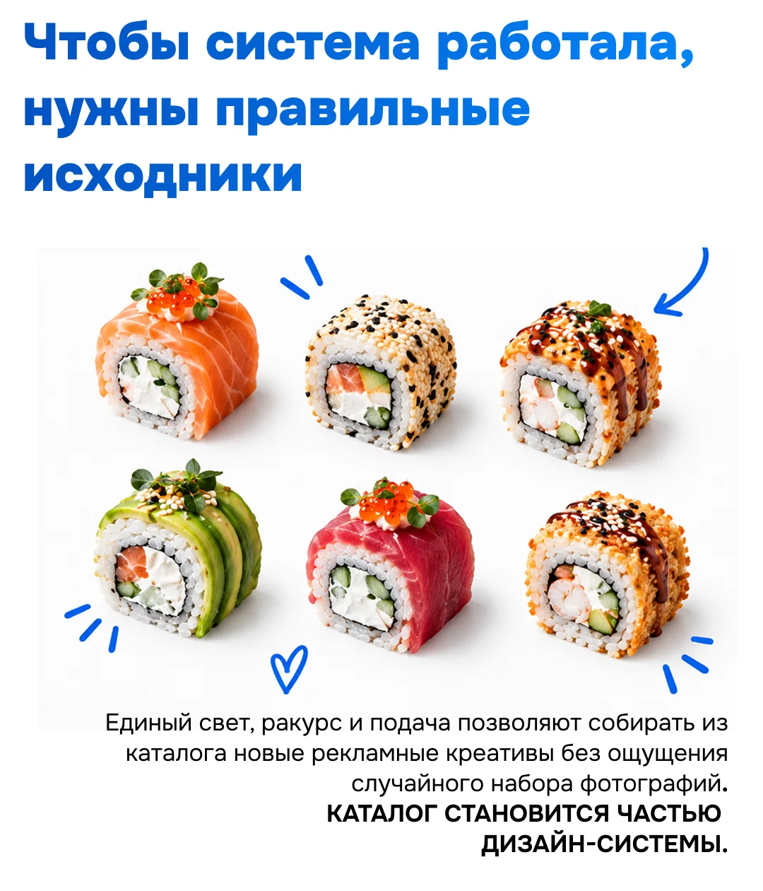
For the system to hold, the source photos matter too — consistent light, angle and styling turn the menu catalogue into part of the design system.
06Outcome
The client received banners for Yandex Maps and the website, a series of social cards, story and post templates and an adapted logo — a scalable ad system rather than a one-off set of images.
New offers and dishes now go out in the same recognisable style, assembled from the catalogue in minutes.